Touring Plans New Look

Grumpy by Birth

Happy by choice
Joined
May 27, 2017
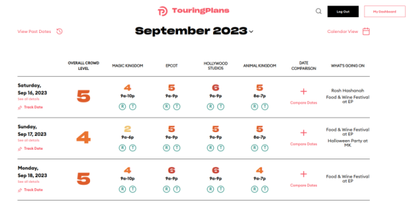
What do you think about the new format/look of the Touring Plans website? It's quite a departure from what I've been used to.

Oddly, depending on how I navigate to the site, I get the legacy version or the new version of my dashboard. I'm guessing it has something to do with clearing my cache, cookies, etc. But I'm not sure why I would get the new version only some of the time.

Touring Plans New Look.jpg
 
What do you think about the new format/look of the Touring Plans website? It's quite a departure from what I've been used to.

Oddly, depending on how I navigate to the site, I get the legacy version or the new version of my dashboard. I'm guessing it has something to do with clearing my cache, cookies, etc. But I'm not sure why I would get the new version only some of the time.
I like the clean graphic new look, but I preferred the older version of the crowd calendar where you could see each individual park at a glance. Having to click on each date to see past the overall crowd number is a hassle
 
Use the App almost exclusively. Noticed the Figment meet & greet hasn't been added yet, but I guess that was a sort of sudden addition.


I like the clean graphic new look, but I preferred the older version of the crowd calendar where you could see each individual park at a glance. Having to click on each date to see past the overall crowd number is a hassle

I agree about the crowd calendar. Also, when did they take away the option to renew for 3 years? My subscription runs out at the end of the month and only gives me the option for 1 year.
 
I like the clean graphic new look, but I preferred the older version of the crowd calendar where you could see each individual park at a glance. Having to click on each date to see past the overall crowd number is a hassle
Agree, crowd calendar was much more user friendly on old site. Seems whenever any site upgrades to a newer version it requires more steps to navigate


they use a CDN, so it's possible parts of the site are cached outside of your browser.
 
Hi folks! A couple of things:

I like the clean graphic new look, but I preferred the older version of the crowd calendar where you could see each individual park at a glance. Having to click on each date to see past the overall crowd number is a hassle

We implemented two layouts for the crowd cal in the new UI. Click on "Row View" to see the classic calendar layout in the new UI:
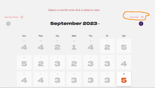
Screenshot from 2023-09-16 10-48-07.png

And you get this:

Screenshot from 2023-09-16 10-51-42.png

Let me know if there's something on that version of the calendar that you're not seeing. We built that second version explictly for people who liked the current layout. And we're happy to keep updating it based on feedback - we want it to be usable, after all.

Right now, we're sending half of the site's traffic to the old version of the site and half to the new version. If you're familiar with the term "A/B testing", that's what we're doing.

The new UI addresses the two consistent pieces of feedback we got on the old site:
  • It needed a "modern" look and feel
  • It had to work better on phones
Use "n.touringplans.com" to get the new version of the site, or "c.touringplans.com" for the "classic" version.

We'll probably route all traffic over to the new UI in October. The old versions of the pages will still be available and the content will update automatically. All new functionality will be on the new pages.

Finally, let me know if you see anything amiss (or missing) on the new UI: len@touringplans.com. And thanks for the feedback.
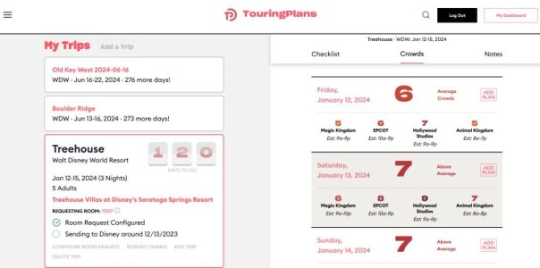
 
Thanks so much @lentesta. I was being routed to the old version so didn't see the changes but now logged in to the new version.

At first glance, I'm missing the green - yellow - red colour scheme to easily see anticipated crowd levels. I see that there are still variants in colours, I just found the old version easier to read. Just my .02.

Looking forward to making time to look around the new version!
 
Ha...I signed on and was like what happened? So far I.like it. I need to do some touring plans and see if anything tweaked there.
 
I too was getting switched back and forth between versions. I found if I just logged out and back in I would get the new version. So it is helpful to know the site is in A/B testing and will roll over soonish.

I actually really like the look of the new version. It is fun and colorful. I will definitely look at the calendar in a row view :)

Thanks touringplans (and DIS) for all you work :)
 
I just logged in and am getting a mix. My dashboard is the old (assuming they've updated it).
 
I cleared my history and was able to see the new format. I'll need to explore it more, but I do like it so far.
 
I got the new version one day on my Chromebook one afternoon and had a hard time finding my upcoming trip and the "touring plans" I had made. I was relieved when I started only seeing the classic version on subsequent visits. I really like the updated look on the new version but, with a trip coming next month, I was concerned.
 
Oh, thanks heavens--I thought I was nuts because I got the new version one day and then it disappeared ever since. :D I love it, @lentesta!
 
How do we do a dining resie search? I do not like this new look. I knew how to navigate old one.
It told me it wasn’t available a few days ago. Not sure if that was temporary or an extended issue.

Not sure if I like it,
 

GET A DISNEY VACATION QUOTE

Dreams Unlimited Travel is committed to providing you with the very best vacation planning experience possible. Our Vacation Planners are experts and will share their honest advice to help you have a magical vacation.

Let us help you with your next Disney Vacation!


Latest posts


facebook twitter
Top