Another question about using the dark transfer paper

MickeyHereWeCome!

DIS Veteran
Joined
Feb 18, 2004
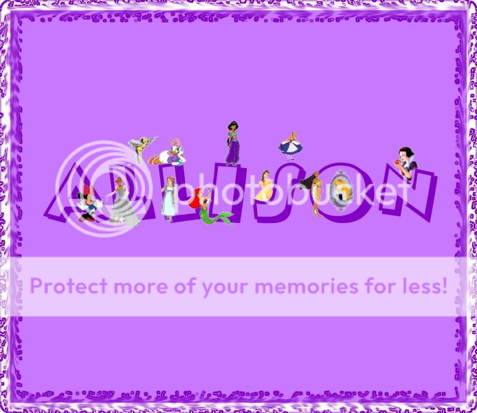
Hi again. I was hoping to get some advice before I waste a shirt :goodvibes . My daughter and I worked on her name design (thanks to the wonderful ideas of Julia&NicksMom, and others with so many clever ideas). It took me all week, but I FINALLY figured out the border thing. She wanted a purple shirt, so I plan to use a light purple shirt that matches the light purple around her name.

So, my question is about the border she has chosen. The outer trim of this particular border doesn't have purple underneath. I can't find a way to get the background color to go under the entire border. If I use this border and the dark paper, will the design show up as it is (with just the dark purple flowery pattern showing showing over the shirt on the edges) or will I be stuck with left over white, since there isn't a color underneath it when it will print. I've never tried the dark paper...obviously....so I'm new to all of this. So basically I just want to know if the transfer will show up like it is pictured here...if I trim it right up to the border?

Thanks, again, for all of your help. I hate to make a pest of myself, but you're all so knowledgeable.
 
Anywhere you see white on the screen will be white on the shirt - if you would like me to help you add a background - let me know
 
I guess it would help if I actually posted the picture :goodvibes

Allison221.jpg


So, the outer part of the border would have white underneath? Yes, if there is a way to put the purple under all of it, I think I'd like that better....if anyone can lend a hand:-).
 
I think the white part would look nice the way it is. But if Kate thinks differently, go with what she says since she has a better developed "eye" for that kind of thing than I do.

Also, I know we've both had our struggles with PhotoImpact here lately. And though I don't see an end in sight, I did create this and wanted to share it where someone would appreciate it! :teeth:

Lauren.gif


I know it's too big to use as my siggie, sadly, but I don't know how to make it smaller! And I should have figured out how to make it transparent while I was at it. LOL Other lessons for other days I guess.


stenogoddess said:
I think the white part would look nice the way it is. But if Kate thinks differently, go with what she says since she has a better developed "eye" for that kind of thing than I do.

Also, I know we've both had our struggles with PhotoImpact here lately. And though I don't see an end in sight, I did create this and wanted to share it where someone would appreciate it! :teeth:

Lauren.gif


I know it's too big to use as my siggie, sadly, but I don't know how to make it smaller! And I should have figured out how to make it transparent while I was at it. LOL Other lessons for other days I guess.


very cute!!! I think that the actual size permitted is 51000 - so I think you might be able to use this!!

and - I agree with you that I like how the white provides some contrast in the design - I tried to erase the white out and add the purple but it blurs the border - so the only other option is another shade of purple
 
I'll try leaving it how it is. It will actually be nice to get another color, other than purple. Can you tell what my daughter's favorite color is? I'll let you know how it turns out.

Stenogoddess....OK, do tell...how did you do it? That is too cute! It will be quite some time before I can venture to those designs.
 
Hehe! Well, I decided to try it for my sig for a while and see how it goes. It's not that much over the allowance! :teeth:

As for how I did it, that was a laborious process but worth it in the end as I felt like I had created something in PhotoImpact that I liked, for once! I've found two fantastic tutorial sites online:

http://wwell.net/tutorials/pi10/

and

http://www.eastofthesun.com/pi8/index.htm

Wishing Well had the one where I made my name. I've just been going through both sites when I have the time. I do their little project, which usually isn't something I actually want or need but it's getting me familer with where things are in the program and what they are capable of doing. I print out the ones I want to remember for later and put them in a binder. Which is growing to be the size of the user's manual. Also, I go back and do the ones for the earlier versions than I have (10) too I just use the manual to look up things because sometimes the locations of something have been changed. It takes some pokiing around for sure sometimes but so far it's generally worked out. I think the top one is my favorite site right now, but they both have a lot to teach. I was going to cut and past the parts about how to make the name, but the website has a pretty strong disclaimer about reprinting their information at any time and place for any reason whatsoever. You'll find it though. :goodvibes


stenogoddess said:
I think the white part would look nice the way it is. But if Kate thinks differently, go with what she says since she has a better developed "eye" for that kind of thing than I do.

Also, I know we've both had our struggles with PhotoImpact here lately. And though I don't see an end in sight, I did create this and wanted to share it where someone would appreciate it! :teeth:

Lauren.gif


I know it's too big to use as my siggie, sadly, but I don't know how to make it smaller! And I should have figured out how to make it transparent while I was at it. LOL Other lessons for other days I guess.

Don't mean to hijack the thread, but this is so cool! You've figured out something cool! :goodvibes
 
MickeyHereWeCome! said:
I'll try leaving it how it is. It will actually be nice to get another color, other than purple. Can you tell what my daughter's favorite color is? I'll let you know how it turns out.

Stenogoddess....OK, do tell...how did you do it? That is too cute! It will be quite some time before I can venture to those designs.

I think with all the purple in the design, the other two gals' opinion is right on.... I too think the white will actually look really nice around it! Definitely let us see how it turns out when you get it finished! :goodvibes
 

GET A DISNEY VACATION QUOTE

Dreams Unlimited Travel is committed to providing you with the very best vacation planning experience possible. Our Vacation Planners are experts and will share their honest advice to help you have a magical vacation.

Let us help you with your next Disney Vacation!


facebook twitter
Top